The hardest part of the transition from laying out pages with tables to using CSS and nested DIVs, was for me the tedious process of testing the layouts on different browsers and finding that the code was being interpreted in wildly different (sometimes completely illogical) manners, yet not being able to visualize exactly what each browser was “seeing”.
I came up with the simple solution of assigning each troublesome DIV a different colour border, which would give an immediate picture of the layout when viewed in a browser. High contrast colours work best, and you can also choose between solid or dotted lines.
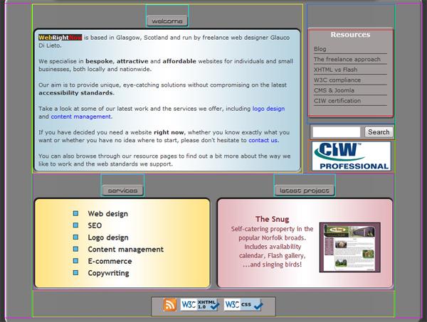
Now if a DIV has misteriously jumped to one side for no apparent reason, it’s much easier to work out its relationship with its neighbouring DIVs and find a solution – which more often than not requires a lot of trial and error.
One thing worth noting is that borders are placed outside the DIV by default, so if you give your CSS element a width of, say, 600 px and then specify a 1 px border, you effectively get a 602 px wide DIV. This can mess things up if you are placing that DIV inside another 600 px wide wrapper, so make sure you either increase the wrapper’s width, or decrease the inner DIV accordingly.
Once you have come up with a nesting arrangement that all browsers render consistently (good luck with that!), you can easily remove the borders and, if needed, resize the CSS elements.